Thursday, 21 June 2012

Gustav Klimt Influences


Gustav Klimt Influences 


When editing my photos I though it would be interesting to add the patterns and shapes Gustav Klimt used in his ' The Kiss ' painting. 


In the image above I layered the photo with another image of spirals similar to the spirals Klimt often used in his paintings. 


In the image below I decided to decorate the photo giving it a more abstract appearance using colorful squares and rectangles similar to the shapes Gustav used in ' The Kiss '. 
I decided to use colours similar to the colours on the girls dress to draw out the multiple shapes overlapping each other. I also used a different thickness to draw each square / rectangle and filled some of them in.  


Repetition and Bold Colours

Repetition and Bold Colours 


After taking my photographs I decided to edit them to give them a more interesting visual. Inspired by Matisse's painting technique of adding bright bold colours I decided to incorporate this into my own work. 
Using an editing software I repeated the image and changed each division into a different colour that contrast and compliment each other well. I like the way the images overlap each other creating an illusion. 


For the picture below I chose more subtle colours and repeated the image to create the form of a pattern. 
I very much enjoyed editing my photographs and exploring different ways to make them look more interesting. I had the opportunity of  applying my creativity in a different way and developed my skills using a photo editing software. 


Symmetrical Pattern

Symmetrical Pattern 

After researching up on Alexander McQueen's dresses inspired by symmetrical pattern I decided to incorporate this design technique into some of my photographs using a Photoshop, a photo editing software. 


The symmetrical and repetition technique strongly relates to the formation of a pattern and I tried to create simple patterns using my own Photographs. 


Above is a transfer fabric print I made inspired by Islamic Patterns. 
The geometrical shape has multiple lines of symmetry in it. 


Below is one of my photographs that I duplicated into a reversed image to give the effect of a symmetrical image. I also layered the image of the fabric print that I scanned in to the computer on top of it creating a fading illusion. Here you can see how the line of symmetry in both images fit perfectly and creates an interesting visual. 


Below is another photograph of mine that I took and duplicated into a reversed image to create a line of symmetry. The bright colours and pattern of his shirt is what attracted me to him to take a photo. His appearance was very unique also. 


Oxford Street Photographs

Oxford Street Photographs 

Below are a few of the Photographs I took of people on Oxford Street. 


I stopped this guy because I liked the Aztec Pattern on his bag.The use of different shapes, lines and colours attracted me to it. 


I really liked this woman's light denim jacket and burgundy skirt, It made a strong contrast that made her stand out from the crowd. I also liked the bright colours and pattern of fruit on her neck scarf. 
Her style looked like she had just walked out of the 80's.. I loved it! 


This guys appearance was very unique to me, I just had to stop and ask to take a photo. You can tell that he was very enthusiastic and and loved his moment in front of the camera. 
I liked the design and colours of his army print jacket. 


These two guys stood out from the crowd in Oxford street and I'm sure it was because of the bright orange jacket I just couldn't look past. The guys varsity jacket is very vibrant in colour and contrasts well with the blue plimsolls. I liked the guy on the lefts black and white polka dot jacket. 
Displaying an example of the repetition of a shape involved in pattern.  


African Patterns and Symbolism

African Patterns and Symbolism


Above is an image of a traditional cloth created in Ghana called ' Kente '. The cloth is woven with rich bright colours and decorative patterns are repeated throughout the cloth similar to Aztec Patterns.  


Below is a traditional African Symbol called "Gye Nyame" is an Adrinkra symbol from Ghana, 
literally meaning "except for God". 


Traditional Symbols are also used as a form of pattern on kente cloth. Similar to the way Gustav Klimt often used symbolism in his paintings to convey different meaning and to give his paintings more depth. 


Below are more African symbols with a meaning behind them that are often used as patterns. 


Islamic Patterns

Islamic Patterns 


I also decided to look at Islamic patterns because I was fascinated by the  Geometric influence used to create them. Islamic pattern are known to have a very complicated formation and I was excited by the challenge of this if I was to make own interpretations. Islamic Patterns normally consist of four basic shapes that are repeated to construct more complicated looking patterns. 


'  circles and interlaced circles; squares or four-sided polygons; the ubiquitous star pattern, ultimately derived from squares and triangles inscribed in a circle; and multisided polygon ' 


Islamic Architecture 


Islamic Pattern are usually used to embellish Islamic buildings and monuments to express their culture and give them a unique appearance. 


These abstract designs don't only adorn the surfaces of monumental Islamic Architecture but they are also used as a decorative element on a vast array of subjects. Geometric ornamentation is not only popular in the Islamic World, the sources of the intricate patterns already existed among the Greeks and Romans. 


For my project I planned to make my own interpretations of Islamic art by exploring different ways to use simple shapes to create the form of a complicated pattern. 

I did this buy cutting out a stencil of a star shape and printing it on fabric using heat transfer. I then scanned an image of the pattern of the fabric into the computer and edited it by layering the image with multiple replicas on top of it at different angles transforming it into a different looking shape. 

And this was one of my results 

Friday, 15 June 2012

Aztec Patterns In Fashion


Aztec Patterns In Fashion


During my project I will also be looking Aztec Patterns. The bright colours and repetitive rows of shapes 
form interesting and unique looking patterns. I will be creating some lino prints to create my own interpretation of  Aztec patterns and be sure to include vibrant colours and strong shapes that stand out. 


 Also, it seems the traditional patterns of the Aztecs has proven to be very popular within the fashion industry. Nowadays you see lot of high street fashion garments with different styles of Aztec Patterns. 


Trip to Oxford Street

Oxford Street


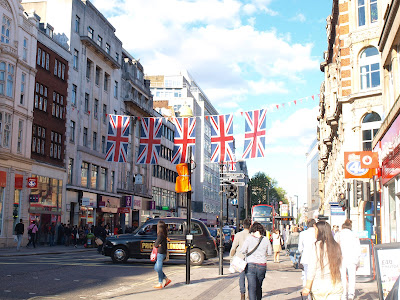
I decided to Choose Oxford street as my location to spot people in interesting patterned clothing. 
Oxford street is known to attract Stylish Londoners with it's high street fashion stores and independent clothing boutiques. 


I went a long with my sister to ask strangers on the street if I could take a photo of them, fortunately not one of them turned me away and were flattered that I wanted to take a picture of them. 

The weather was very nice that day, which I was very happy about! 

Wednesday, 13 June 2012

Alexander Mcqueen

Alexander McQueen 


This dress was created by the late Alexander McQueen in 2010. The dress was a part of his spring 2010 collection where his designs mostly involved reptile skin, patterns and symmetrical prints. The dress is designed with a bold print of red and black coloured snakes, relating to the texture, colour and pattern of reptiles.  What stood out to me the most about this dress was its unique appearance, the red and black bold print and the use of symmetrical pattern made it fascinating and eye catching.

 I think that this garment represents form well as it has two diverse forms that have been put together to create one piece. The smooth, red and black reptile dress and the hard angular Armour suit underneath is a combination of two contrasting textures that add an interesting factor to the appearance of the dress.  These two forms put together make the garment have multiple of meanings and gives a whole new dimension to the piece.

The dress seems to exaggerate the female form as the shoulders of the dress are enhanced by the edgy shaped angular sculpting of the garment and its broad appearance balances out the waist of the model making it appear smaller as she goes outwards from her hips accentuating the shape of her figure.  The initial impression of the garment reminds me strongly of reptiles from the repetitive symmetrical pattern of the reptile skin and it also gives the impression of movement as if the snakes are moving and weaving through each other. 

The symmetrical aspect of his pattern designs is something I would like to incorporate in my project with the use of repetition and reflection. When editing my photographs I will be sure to use these techniques to understand the process of pattern and also include the use of bright and bold colors.


Tuesday, 8 May 2012

Henri Matisse

The History of Pattern 


The second artist I chose to study was Henri Matisse; similar to Gustav Klimt he uses bold patterns and often makes humans the main subject of his paintings.  He also uses the colour black to outline the patterns in his paintings giving them a bold appearance. Similar to Gustav Klimt ‘ The Kiss’, Matisse includes patterned fabrics in his paintings such as wall hangings, rugs and materials on ladies garments. 


Henri Matisse (1869 – 1954)

In 1869 Henri Matisse was born in the Picardy region of northern France. At 21 years old Henri Matisse became seriously ill and while recovering slowly he became intrigued by the practice of painting. In 1892, he went to Paris to study art formally. He attended art classes at the Ecole des Beaux-Arts in Paris and dabbled in different styles. In terms of the use of colour to render forms and organize spatial planes he was influenced by the impressionist and post-impressionist painters Pisarro, Cezanne, van Gogh, Gauguin and Paul Signac. Around the year 1905 he finally found his own style characterized by daring, bright colours executed in a broad brush stroke.


Interior With Aubergines 


‘Interior with Aubergines’ is oil on canvas painting painted by Henri Matisse in 1911. The painting shows a table on which there are three aubergines. A pattern of large blue flowers covers both the floor and wall flatly. When painted over the brown of the floor the flowers are read as the carpet, when painted over the brown of the wall, they are read as the wall paper. The creative illusion by the clever placement of the patterns is what interests me about this painting. When looking at this painting I am lead to wonder where the pattern used to decorate the interior of this room starts and ends.

The curvaceous patterns and the boldness of the white and green colours is what attracted me to this painting as it has a bold contrast against the brightness of the orange, brown and purple colours surrounding it. The shape and form of the pattern comes across to me as a luxurious and wealthy decorative design.  The composition of the painting places the table with the aubergines in the centre of the room making it the main focus of the painting and to also represent its importance to Matisse in the painting as he also named the painting after the aubergines.

To the left of the painting there appears to be a door passage to another room, possibly a bedroom where few objects have been placed inside it. From the angle Matisse has painted it; it is only possible to see a small fraction of the room through the door and past the rim of the door the same green and white pattern it also painted through this space causing me to wonder whether the door passage way is non-existent and is still a part of the room.

I think Matisse purposely did this to confuse the viewer and to make them think twice about the composition of the room. On the right of the painting an open window framed in bright orange is seen showing outside scenery to a rural landscape. The bright contrast of orange and green speaks out to me and make a bold statement when placed with each other. Similar to Klimt, Matisse displays the use of bold patterns in this painting and the use of bold and bright colours. 


Black Leaf on Green Background 


Black Leaf on Green Background (1952) by Henri Matisse was made with Gouache and cut paper on paper. During the early to mid-1940s Matisse was in poor health. Eventually by 1950 he stopped painting in favour of his paper cut-outs. Black Leaf on Green Background is an example of Matisse's final body of works known as the cut-outs. The simplicity and brightness of Henri Matisse’s later work caught my attention also. The bold leaf like pattern shapes with rounded tentacles inspires me to explore this unusual shape and practice paper cut outs of my own.


During my project I will take Matisse’s use of bold bright colours into account and use his techniques in my own interpretations.

Gustav Klimt

The History of Pattern 

As apart of Secondary Research for my project I will be looking at various Artists work for inspiration and to also gain an understanding about the use of patterns in early paintings. I will also be comparing the Artists I research and explain how I will be incorporating their ideas into some of my project work. 

The use of pattern allows colour, shape, symbolism, creativity, tradition, class and culture to shine through a piece of art work with the use of ornamental repetition alone and this is what interests me. The link between Patterns and Symbolism also fascinates me; this is why I have chosen Gustav Klimt to study as he was known to not only paint with the ornamental designs but they had meaning behind them. 


Gustav Klimt (1862–1918)

Gustav Klimt (1862 -1918) was an Austrian Symbolist painter and one of the most prominent members of the Vienna Secession movement. Klimt was born in a country suburb near Vienna in 1862. He and his two brothers were introduced to art through their father’s profession, an engraver in Gold and Silver. In 1876, Klimt was awarded a scholarship to the Vienna School of Arts and Crafts, where he studied until 1883, and received training in a variety of media including Fresco painting and mosaic as an architectural painter.

During the Vienna Secession Klimt had developed his own characteristic style. Gustav Klimt's was said to have gone through a ‘Golden Period ‘where many of his paintings were painted with gold leaf. His style was highly ornamental and he used a lot of Gold and Silver in his art work. He travelled little, but trips to Venice and Ravenna, both famous for their beautiful mosaics, most likely inspired his gold technique and his Byzantine imagery.  


The Kiss  

‘The Kiss’ was painted in 1907-1908 by Gustav Klimt, during his ‘Golden period’, and is considered to be the most famous piece of art work he has ever produced.  The painting is painted with oil paint and gold leaf. Klimt’s ‘Golden period’ was perhaps the result of an influential insight to the world of art and craftsmanship from his father who was a Gold engraver. By observing ‘The kiss’ it is evident that Klimt’s exposure to Byzantine Frescoes mosaics of the churches of Ravenna and Japanese art were main inspirations that helped him to produce this painting.


In this painting Klimt was able to synthesize into powerful single images of simultaneous decorative and symbolic content and the Kiss is a perfect example that displays this. Here he uses various patterns, shapes and expressivity in this painting and the combination of all three is what interests me about this painting and  influences me to think about the representation and symbolism that he tries to portray in this particular painting.

Not only that but the bright use of colours mainly consisting of yellow, black and shimmering gold used to paint this is what attracts me also, the glittery gold background gives a sense of a gritty texture similar to granite on the ground in contrast to the possibly soft and smooth texture of the quilt the couple are wrapped in. I feel that these colours and contrast of textures go well together and makes the painting interesting and unique; this is why I included these elements in my final piece.

I particularly like the black rectangular shapes that add boldness to the painting and I have included this bold feature into my final piece making the shapes and patterns stand out. Klimt’s use of bold patterns, shapes and unique combination of colours are elements that inspired me to include them in my final piece.The composition of the painting makes the couple the main subject in the painting as they are placed in the center of the painting to represent that they are the main subject and the focus of attention in the image. 


Below are some more images of Klimt's work that involved the use of pattern I also find inspiring 


Street Style Fashion ( with patterns )


Street Style Fashion ( with patterns ) 

Pattern is the repetition of an element and can be achievable through the use of colours, lines or shapes.  Colour and shape will be an important element in relation to pattern. I have decided to title my own personal project ‘Street-Style Pattern’ as I will work towards producing a project that gives attention to the efforts of everyday people from different areas and backgrounds. Focusing on their own unique style and approach towards vintage/ modern day fashion that feature pattern and print.
 

My idea for this project was influenced by one single photo (below) I took during my pathway stage project.


I chose to go to Camden in North London to take photographs and I spotted this young man naturally posing against a brick wall that stood out from the crowd.
The unusual looking tailored suit with the sharp shoulder padded blazer intrigued me. He looked confident with his unique style and laid back attitude. I asked to take a photo and he agreed to it straight away. I wish I had more time to take more photos of him but as I was taking it I was interrupting people walking by so it was a very brief encounter. 


My Tutors in College particularly liked this photo and suggested some great ideas for me to consider and be creative with. 

My proposed end point will be to create a published book that will display my street fashion photography, different patterns and distorted images with the use of reflection, rotation and translation. I would also like to create promotional material for the book by creating a banner that displays some patterned work of mine including some typography.